userlQcCM1wRc8
Black Hole
Options
- Mark as New
- Bookmark
- Subscribe
- Mute
- Subscribe to RSS Feed
- Permalink
- Report Inappropriate Content
09-28-2022 02:51 PM (Last edited 09-28-2022 07:55 PM ) in
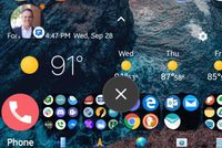
DiscussionsI was hoping One UI 5 would ditch the big pop up box more bubbles when dismissing a bubble notification.
It is totally useless😑
Also when dragging the bubble notification to the X to dismiss is way too precise. Have to hit that X spot on or it becomes a bubble game.
Why can't I add screen shots to this message. They appear and then go away only leaving the place holders.
Samsung members app needs to address this.
Cover image
Cover image


4 Replies
LordJae
Constellation
Options
- Mark as New
- Bookmark
- Subscribe
- Mute
- Subscribe to RSS Feed
- Permalink
- Report Inappropriate Content
09-28-2022 02:55 PM in
Discussions
Been dealing with this as well. It's definitely an annoyance.
Reply
KBWolf
Comet
Options
- Mark as New
- Bookmark
- Subscribe
- Mute
- Subscribe to RSS Feed
- Permalink
- Report Inappropriate Content
09-28-2022 05:55 PM in
Discussions
Add your pics in a comment, post pics have been broken for a while now unless you're really quick with hitting post after attaching photos.
Reply
userlQcCM1wRc8
Black Hole
Options
- Mark as New
- Bookmark
- Subscribe
- Mute
- Subscribe to RSS Feed
- Permalink
- Report Inappropriate Content
09-28-2022 07:57 PM in
Discussions
This is what I mean by the useless blob telling me there are no more bubbles. Lose this thing Sammy. 👍 


USBetaModerator
Beta Moderator
Options
- Mark as New
- Bookmark
- Subscribe
- Mute
- Subscribe to RSS Feed
- Permalink
10-03-2022 03:53 PM in
DiscussionsHello,
Thank you for your feedback. We will pass on your feedback to our usability team for review.
Regards,
One UI Beta Team
Opens in new window
PDF Download
Word Download
Excel Download
PowerPoint Download
Document Download
