- Mark as New
- Bookmark
- Subscribe
- Mute
- Subscribe to RSS Feed
- Permalink
- Report Inappropriate Content
08-05-2023 01:46 PM in
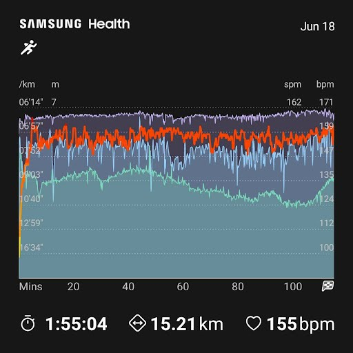
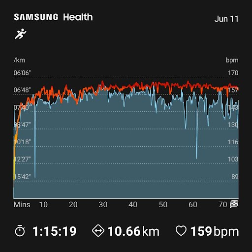
Galaxy WatchIn the most recent update to the Samsung Health app, the charts for exercise have gotten substantially worse. Let's do a side-by-side comparison!
In the first example, I'm able to have all 4 metrics in a single chart!
In the second example, I've picked a screenshot that shows clearly the red coloring of the Heart Rate line has a different shade for each HR zone.
By way of comparison, I have the following complaints:
- I am now limited to only 2 metrics per chart
- the fill under any of the lines is too saturated while the other line is too light making it very difficult to read
- the HR line no longer shows zone via its coloring
- I'm limited to sharing the pace / HR chart only, forcing a screenshot that reveals my location when sharing other metric combos
Also Your forum registration is terrible! I can't even use my name. https://twitter.com/DeepThoth/status/1687923235827195904
Solved! Go to Solution.
- Mark as New
- Bookmark
- Subscribe
- Mute
- Subscribe to RSS Feed
- Permalink
- Report Inappropriate Content
08-05-2023 04:21 PM in
Galaxy WatchMy issues with the update aren't exactly the same as yours, but I agree that I prefer the previous version.
Galaxy S24 Ultra, Active4
- Mark as New
- Bookmark
- Subscribe
- Mute
- Subscribe to RSS Feed
- Permalink
08-07-2023 02:15 PM in
Galaxy WatchThank you for reaching out and welcome to the community. We appreciate your feedback and will tag it on the forum so that it will appear with other feedback, ideas, and requests. This will allow your post to be more easily found in the event that Samsung product groups are seeking outside feedback/requests/ideas regarding our products.


