SyCoREAPER
Comet
Options
- Mark as New
- Bookmark
- Subscribe
- Mute
- Subscribe to RSS Feed
- Permalink
- Report Inappropriate Content
08-14-2023 11:38 AM (Last edited 08-14-2023 11:44 AM ) in
Suggestions
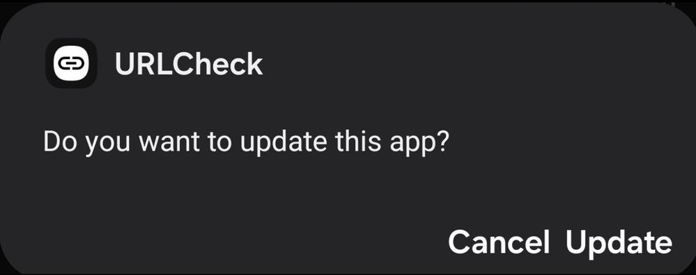
When installing or updating an APK, the Install/Update and Cancel buttons are way too close together.

Same goes for the subsequent Done and Open buttons.
They are literally almost touching eatchother. Display option for Screen is already zoomed out And font second lowest setting.

(Screenshot not to scale, box is smaller and thus harder to select the option desired)
Reply
1 Reply
USBetaModerator
Beta Moderator
Options
- Mark as New
- Bookmark
- Subscribe
- Mute
- Subscribe to RSS Feed
- Permalink
08-14-2023 06:17 PM in
SuggestionsHello,
Thank you for your Feedback. We appreciate your contribution to the Beta community.
Regards,
One UI Beta Team
