PossiblyLucky
Nebula
Options
- Mark as New
- Bookmark
- Subscribe
- Mute
- Subscribe to RSS Feed
- Permalink
- Report Inappropriate Content
08-13-2022 07:31 PM in
Suggestions
Samsung, here's another suggestion I have for you. Please consider removing these awful hideous lines/dividers/seperators from the entire system UI. They are completely unnecessary: we know excatly where to click. These lines are nothing but an eyesore and just make the entire UI look cluttered and dirty. Please look at screenshots I provided for an idea about what I'm talking about. I removed the lines from the images on the Left which makes everything look so clean. On the right is the cluttered mess.
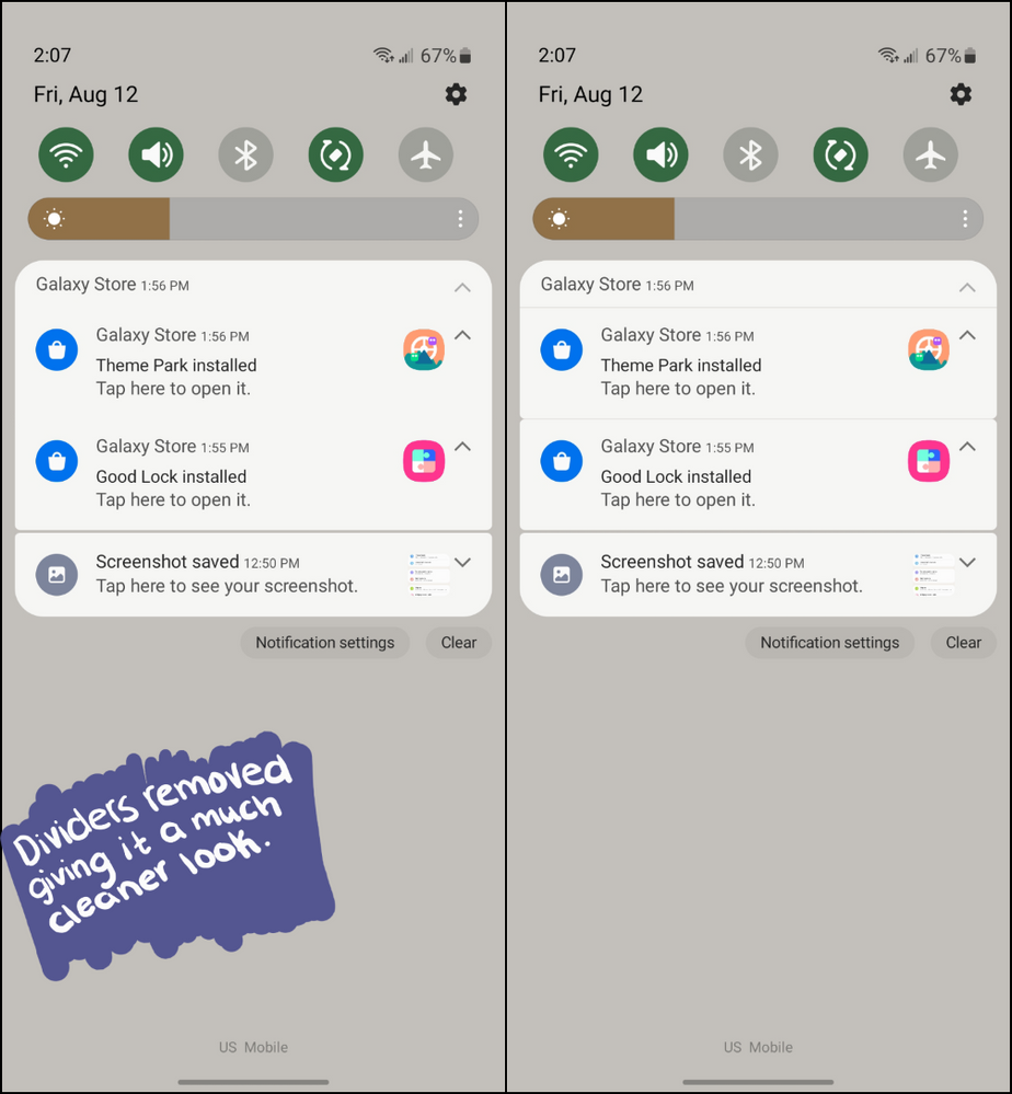
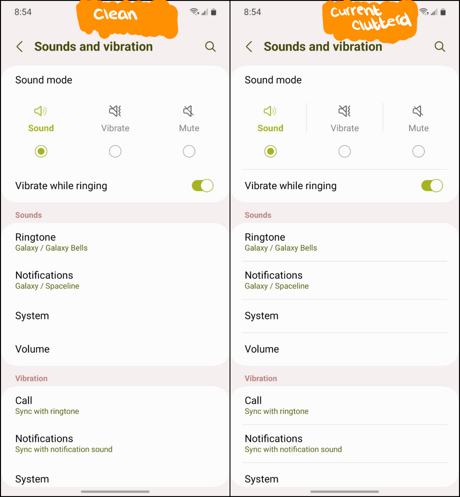
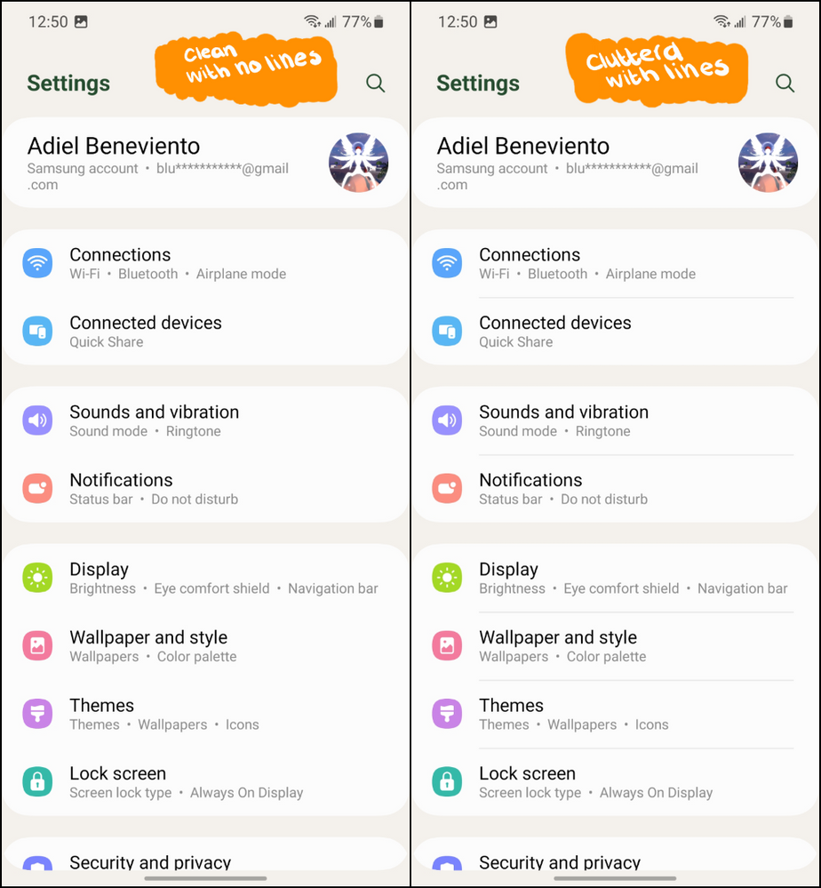
Thank you


Reply
20 Replies
- « Previous
- Next »
USBetaModerator
Beta Moderator
Options
- Mark as New
- Bookmark
- Subscribe
- Mute
- Subscribe to RSS Feed
- Permalink
08-15-2022 08:46 PM in
SuggestionsHello,
Thank you very much for your suggestion. Your suggestion has been communicated to the developer and the development project manager is reviewing the content. After reviewing your suggestions, we will apply them to the official version if your proposal matches our concept. We appreciate your contribution to the beta program.
Regards,
One UI Beta Team
- « Previous
- Next »
