userZNnTdcqwZP
Supernova
Options
- Mark as New
- Bookmark
- Subscribe
- Mute
- Subscribe to RSS Feed
- Permalink
- Report Inappropriate Content
08-29-2022 06:38 AM in
Suggestions
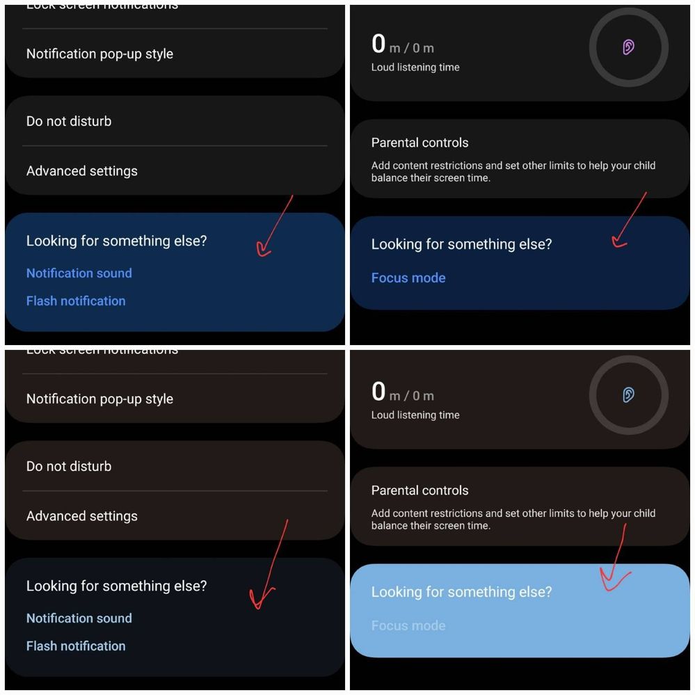
"Looking for something else" in Digital Wellbeing is the only section that looks different from the rest. The difference is not that much when not applying color palette. When it does, the difference is like night and day. This happens in both light and dark mode. l've noticed this since One Ul 4 and thought that it's intentional.

Top row: no color palatte; bottom row: color paletteLeft column: notifications; Right column: Digital Wellbeing

However, when applying color palette, text are not clearly visible in this section.

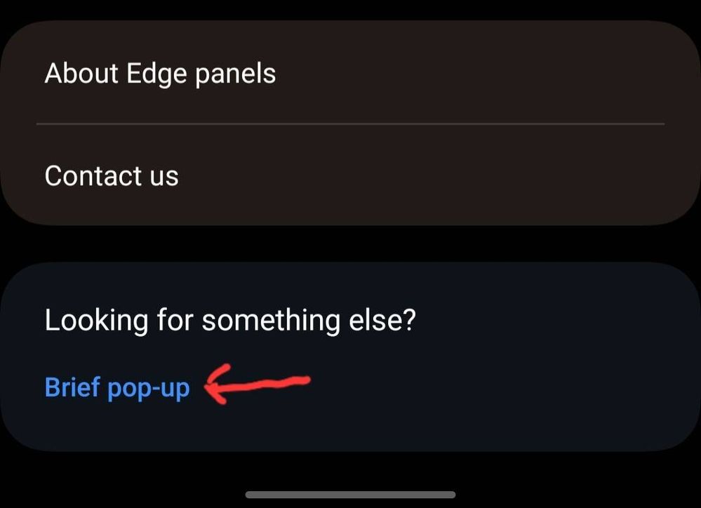
Also, l doubt that the palette is not applied to the text in this section in Edge panels settings.

So please consider to make a change and be more consistent.
Reply
1 Reply
USBetaModerator
Beta Moderator
Options
- Mark as New
- Bookmark
- Subscribe
- Mute
- Subscribe to RSS Feed
- Permalink
08-29-2022 06:52 PM in
SuggestionsHello,
Thank you very much for your suggestion.
Your suggestion has been communicated to the developer and the development project manager is reviewing the content. After reviewing your suggestions, we will apply them to the official version if your proposal matches our concept.
We appreciate your contribution to the beta program.
Regards,
One UI Beta Team
