cancel
Showing results for 
Search instead for 
Did you mean: 

Original topic:

Consistency in UI

(Topic created: 10-09-2022 02:30 AM)
1841 Views
userZNnTdcqwZP
Supernova
Options
Suggestions
I hope the suggestions are not too late because I waited for beta 4 to see if they would polish in this area, but they don't appear to be.

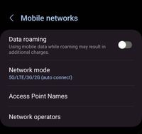
1. Please make sure that "Customization Service" looks consistently throughout the Settings menu.
image
This is an example of what I am talking about.

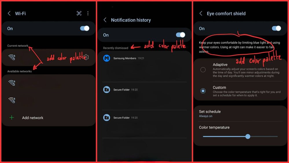
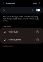
2. Color palette is applied to subheaders and explanatory text in a few places in the Settings. Here's an example.
image
Color palette is applied to subheaders and explanatory text

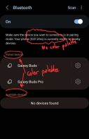
However, some of them are still "unfinished". This is an example.
image
Subheaders and explanatory text are lack of color palette

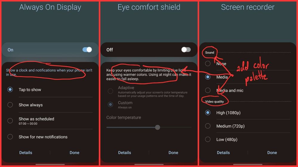
3. Same thing occurs on the quick settings panel. It appears that the only area color palette being applied to subheaders and explanatory text is "Always on Display" section. Please apply the palette to the rest.
image

Edit:
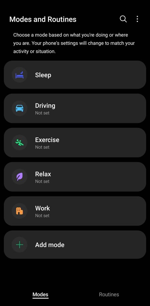
5. There is no color palette is applied in Modes and Routines. Please apply the palette to this page.
image

Even though I show all of these in dark mode, the suggestions should be applicable in light mode as well.
12 Replies
Tom6068
Supernova
Options
Suggestions
That's odd as I look under every settings category in my device and it's consistent throughout.
0 Likes
Reply
userZNnTdcqwZP
Supernova
Options
Suggestions
Are you using Theme Park? That could take care of it.
0 Likes
Reply
Tom6068
Supernova
Options
Suggestions
No, the scheme is from the choice I made in the palette. Where in the OP's examples, my colors are not soft blue within each category and like a darker lavender between categories. The palette image with the schemed checked is the color scheme and the two images are examples. Screenshot_20221009_065300_One UI Home_1000009773_1665312780.jpgScreenshot_20221009_064940_Wallpaper and style_1000009771_1665312580.jpgScreenshot_20221009_065323_Settings_1000009775_1665312803.jpg
0 Likes
Reply
userZNnTdcqwZP
Supernova
Options
Suggestions
In general, color palette is applied constantly for background and headers, but I'm talking about the subheaders and explanatory text.

Could you look in Wifi Settings and see if the lavender is applied to subheaders (e.g. "current network")?
0 Likes
Reply
Tom6068
Supernova
Options
Suggestions
I just expressed that in words and in the images. Wifi doesn't have each category separator language. In each category I gave in image examples, you'll see the light blue. In the category separator space (the darker areas between categories) where a descriptor is, they are lavender.
0 Likes
Reply
userZNnTdcqwZP
Supernova
Options
Suggestions
This is wifi section I am talking about.Screenshot_20221009_094350_Settings_1000002217_1665326160.jpg
0 Likes
Reply
Tom6068
Supernova
Options
Suggestions
You know why that particular setting remains unchanged is because wifi is continuously active, like searching out other networks. Note that the color also doesn't change under Wi-Fi calling. But choose another category under the Connections section and I get the color change.Screenshot_20221009_110017_Call settings_1000009779_1665327617.jpgScreenshot_20221009_110052_Settings_1000009781_1665327653.jpg
0 Likes
Reply
userZNnTdcqwZP
Supernova
Options
Suggestions
Category separators in "Bluetooth" are in color palette. I think bluetooth is also continuously active, isn't it? Even when it's scanning, "Available devices" still shows up.

Also, explanatory text in "Bluetooth" is white unlike explanatory text in "Power saving".Screenshot_20221009_124812_Settings_1000002222_1665334182.jpgScreenshot_20221009_122613_Settings_1000002220_1665332987.jpgScreenshot_20221009_123415_Device care_1000002221_1665333298.jpg
0 Likes
Reply
PrimePixel
Comet
Options
Suggestions
What I think they should do is just remove the things to where they have the color palette applied. It might be better for usability and visibility reasons when it is just a basic black or white color depending on your theme. Though since some colors that Samsung chooses from your wallpapers aren't that bright anyway to the point where you feel uncomfortable seeing or reading the text with that color applied.
0 Likes
Reply