userZNnTdcqwZP
Supernova
Options
- Mark as New
- Bookmark
- Subscribe
- Mute
- Subscribe to RSS Feed
- Permalink
- Report Inappropriate Content
08-27-2022 10:10 AM in
Suggestions
When extending stack notification, I think there are unnecessary breaks/separations for each notification (in blue circles) since they are notifications for the same app. I think these should be removed to give a feeling of unity.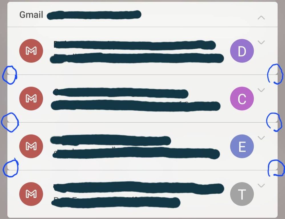
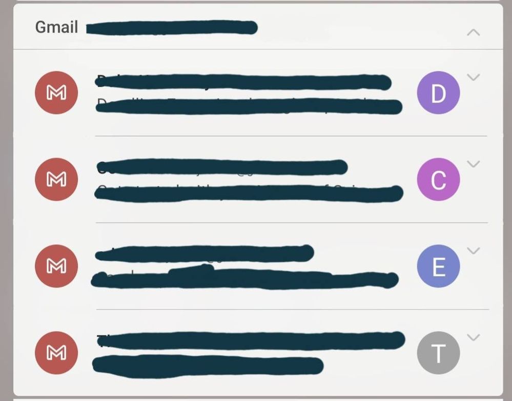
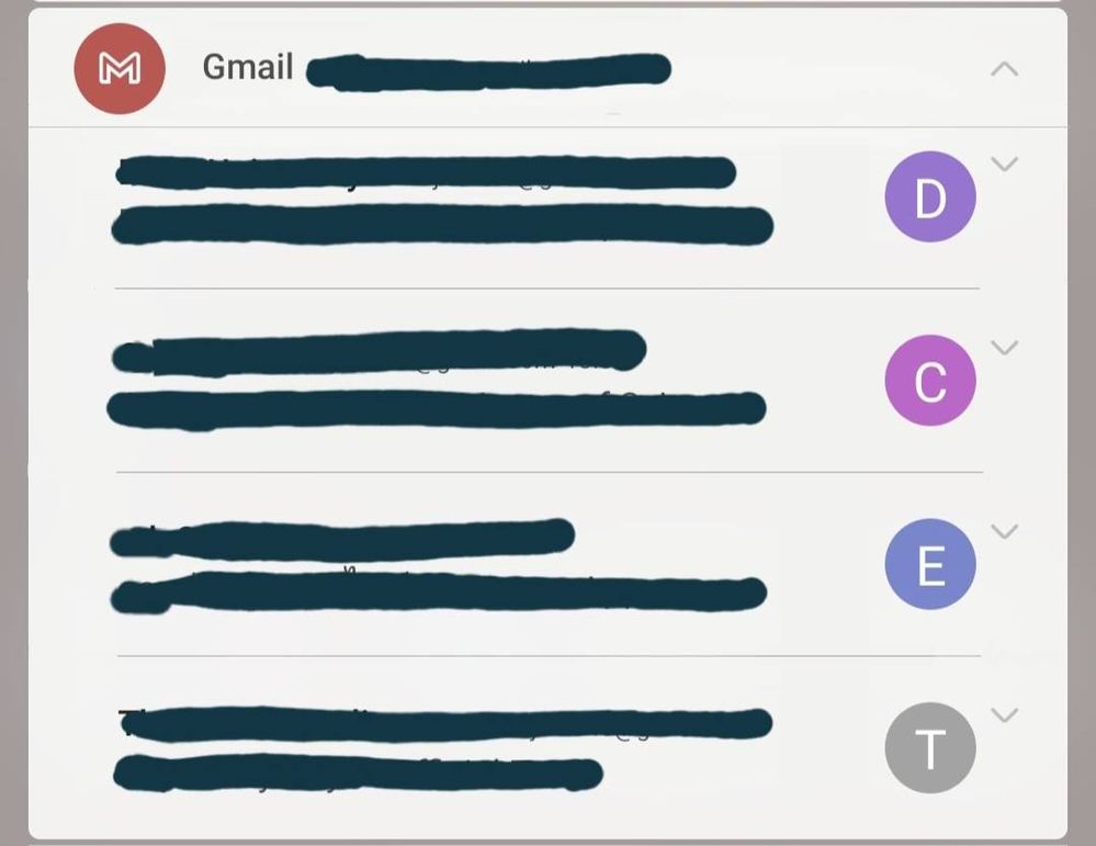

If these were removed and separation lines were shortened, it would look something like this. (I think it's cleaner)

If icons on the left seem to be redundant, it could be reduced and only show at the top like this (feel a bit like One UI 4)

Reply
2 Replies
Sveney
Cosmic Ray
Options
- Mark as New
- Bookmark
- Subscribe
- Mute
- Subscribe to RSS Feed
- Permalink
- Report Inappropriate Content
08-27-2022 02:05 PM in
Suggestions
I agree and didn't even notice this
Reply
USBetaModerator
Beta Moderator
Options
- Mark as New
- Bookmark
- Subscribe
- Mute
- Subscribe to RSS Feed
- Permalink
08-29-2022 09:07 AM in
SuggestionsHello,
Thank you very much for your suggestion.
Your suggestion has been communicated to the developer and the development project manager is reviewing the content. After reviewing your suggestions, we will apply them to the official version if your proposal matches our concept.
We appreciate your contribution to the beta program.
Regards,
One UI Beta Team
