MattURL
Cosmic Ray
Options
- Mark as New
- Bookmark
- Subscribe
- Mute
- Subscribe to RSS Feed
- Permalink
- Report Inappropriate Content
09-22-2022 11:56 AM (Last edited 09-22-2022 11:59 AM ) in
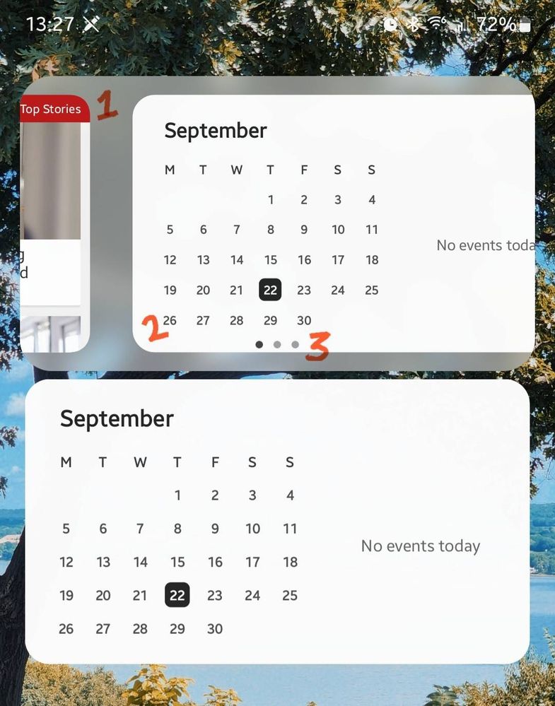
SuggestionsSwiping between stacked widgets doesn't feel as polished as it could be. I've annotated my suggestions below.
1. Is the semi-opaque background to the widgets necessary? I would remove this background as it adds an unnecessary layer to the homescreen, which can feel cramped. It doesn't feel consistent with the rest of One UI design.
2. The widgets resize as you swipe between them, and as they do, the radius of the corners do not match that of the semi-opaque background, or other static widgets placed on the homescreen, which feels jarring. I would recommend removing the resizing effect, leaving the widgets full-size as you swipe between them.
3. As you swipe between homepages, or return to Home from another app, the indicators appear above stacked widgets. I would alter this to only show when the widget is being interacted with by the user.

1 Reply
USBetaModerator
Beta Moderator
Options
- Mark as New
- Bookmark
- Subscribe
- Mute
- Subscribe to RSS Feed
- Permalink
09-22-2022 12:20 PM in
SuggestionsHello,
Thank you very much for your suggestion.
Your suggestion has been communicated to the developer and the development project manager is reviewing the content. After reviewing your suggestions, we will apply them to the official version if your proposal matches our concept.
We appreciate your contribution to the beta program.
Regards,
One UI Beta Team
Opens in new window
PDF Download
Word Download
Excel Download
PowerPoint Download
Document Download
Reply
