- Mark as New
- Bookmark
- Subscribe
- Mute
- Subscribe to RSS Feed
- Permalink
- Report Inappropriate Content
08-11-2022 10:51 AM in
Suggestions
- Mark as New
- Bookmark
- Subscribe
- Mute
- Subscribe to RSS Feed
- Permalink
- Report Inappropriate Content
08-11-2022 10:58 AM in
Suggestions- Mark as New
- Bookmark
- Subscribe
- Mute
- Subscribe to RSS Feed
- Permalink
- Report Inappropriate Content
08-11-2022 11:01 AM in
Suggestions- Mark as New
- Bookmark
- Subscribe
- Mute
- Subscribe to RSS Feed
- Permalink
- Report Inappropriate Content
08-11-2022 11:20 AM in
Suggestions- Mark as New
- Bookmark
- Subscribe
- Mute
- Subscribe to RSS Feed
- Permalink
08-11-2022 12:20 PM in
SuggestionsHello,
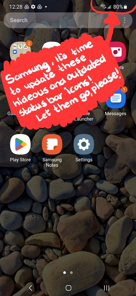
Thank you very much for your suggestion. Your suggestion has been communicated to the developer and the development project manager is reviewing the content. After reviewing your suggestions, we will apply them to the official version if your proposal matches our concept. We appreciate your contribution to the beta program.
Regards,
One UI Beta Team
- Mark as New
- Bookmark
- Subscribe
- Mute
- Subscribe to RSS Feed
- Permalink
- Report Inappropriate Content
08-11-2022 12:37 PM in
SuggestionsLike IOS, Pixel, older android or ios
- Mark as New
- Bookmark
- Subscribe
- Mute
- Subscribe to RSS Feed
- Permalink
- Report Inappropriate Content
08-11-2022 03:10 PM in
Suggestions- Mark as New
- Bookmark
- Subscribe
- Mute
- Subscribe to RSS Feed
- Permalink
- Report Inappropriate Content
08-11-2022 05:50 PM in
SuggestionsWhy would we want these icons to look different? Would anyone be willing to share ideas of what they would want these icons to look like?
- Mark as New
- Bookmark
- Subscribe
- Mute
- Subscribe to RSS Feed
- Permalink
- Report Inappropriate Content
08-11-2022 06:34 PM in
Suggestions- Mark as New
- Bookmark
- Subscribe
- Mute
- Subscribe to RSS Feed
- Permalink
- Report Inappropriate Content
08-12-2022 08:02 AM in
Suggestions