PossiblyLucky
Nebula
Options
- Mark as New
- Bookmark
- Subscribe
- Mute
- Subscribe to RSS Feed
- Permalink
- Report Inappropriate Content
08-11-2022 10:51 AM in
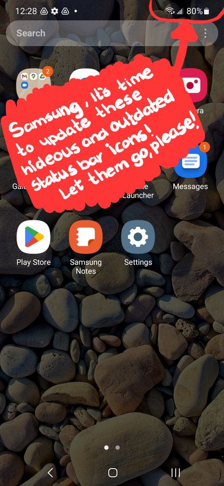
SuggestionsOkay, Samsung, I think the time has come for you guys to finally give us updated statusbar icons. It is 2022, not 2012. We need something fresh and new. I'd ask that we make them appear closer to "stock" Android.
I understand that it's hard for you guys to let these go, but it's time, Samsung. Many have requested this and there has been no change. Please take this into consideration. The current statusbar icons ruin the entire fresh aesthetic of OneUI. They are plain ugly and outdated.

Reply
14 Replies
- « Previous
-
- 1
- 2
- Next »
Philosophics
Nebula
Options
- Mark as New
- Bookmark
- Subscribe
- Mute
- Subscribe to RSS Feed
- Permalink
- Report Inappropriate Content
08-12-2022 08:39 AM in
Suggestions
Please explain how a signal meter consisting of 5 vertical bars is considered unclean?
Are you going to share pictures of your ideas of what they should be changed to?
Are you going to share pictures of your ideas of what they should be changed to?
User5741
Comet
Options
- Mark as New
- Bookmark
- Subscribe
- Mute
- Subscribe to RSS Feed
- Permalink
- Report Inappropriate Content
08-12-2022 12:02 PM in
Suggestions
I personally think that the battery indicator should be flipped horizontally and put the battery percentage inside it to save space. Also, when battery saver is turned on, just change the current battery icon to the low power icon rather than adding another separate icon. It gets cluttered fast. The wifi symbol is fine but remove the up and down arrows. We just need the wifi bars and the 6 for if it's on wifi 6 or not. The icon for mobile data should change and be 4 bars for max strength rather than 5 bars so it matches the number of lines like the wifi icon. And lastly, these icons should have some color to them or at least the battery icon should. When between 100 and 60 percent green, 59 and 21 yellow, and 20 to 0 should be red. This would add some life to the notification bar and make it feel like part of the UI rather than an afterthought that no one bothers to make look good. Out of the box, the only things that should be displayed in the notification bar is the time, wifi, mobile data, bluetooth, and the battery with the percentage on the inside of the icon.
Reply
Dakuanb
Galaxy
Options
- Mark as New
- Bookmark
- Subscribe
- Mute
- Subscribe to RSS Feed
- Permalink
- Report Inappropriate Content
08-20-2022 12:55 PM in
Suggestions
Eons ago the battery was colored. During the TouchWiz Era. And I believe the colors corresponded with your numbers too
User5741
Comet
Options
- Mark as New
- Bookmark
- Subscribe
- Mute
- Subscribe to RSS Feed
- Permalink
- Report Inappropriate Content
08-20-2022 10:38 PM in
Suggestions
Well they should bring that back but cleaner and matching one ui with less saturated colors and the color transitions smoothly between green yellow and red so it can be clean and feel polished. I never knew that though so thanks for the little android history lesson😂!
Reply
userVzTHB81wN9
Cosmic Ray
Options
- Mark as New
- Bookmark
- Subscribe
- Mute
- Subscribe to RSS Feed
- Permalink
- Report Inappropriate Content
09-15-2022 12:34 PM in
Suggestions
I agree, I'm pretty sure my original Galaxy had the same status bar icons and def my galaxy S3. Either way, I agree, it's in the details..
- « Previous
-
- 1
- 2
- Next »
