userZNnTdcqwZP
Supernova
Options
- Mark as New
- Bookmark
- Subscribe
- Mute
- Subscribe to RSS Feed
- Permalink
- Report Inappropriate Content
09-20-2022 06:57 AM (Last edited 09-20-2022 07:58 AM ) in
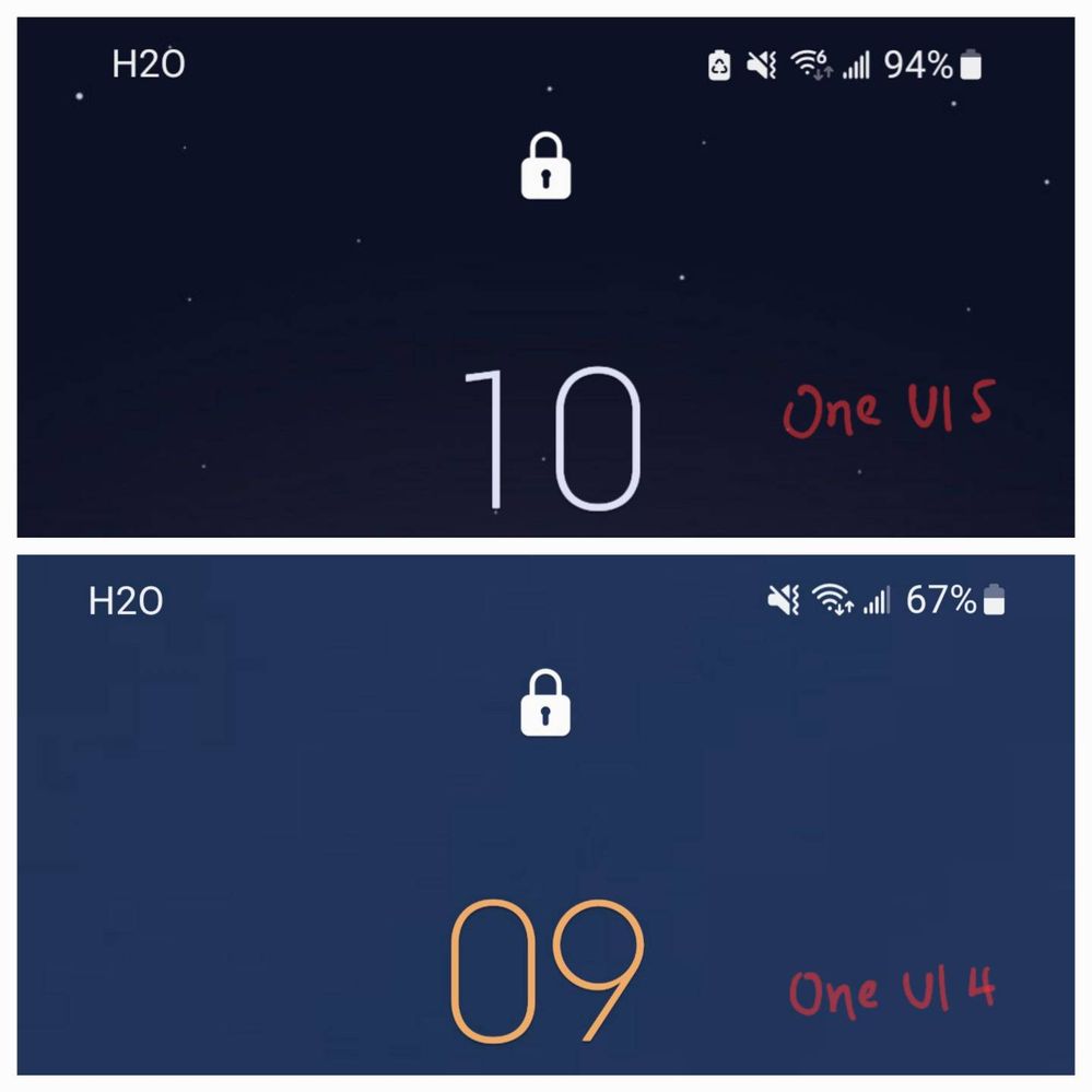
DiscussionsIs it just me feeling that icons on both sides have moved closer to the center than before?
Now, the left and right sides have lot of space.

Edit:
Took me a while to find a screenshot of One UI4 to compare with this. I'm still undecided which I prefer.

Reply
5 Replies
useryL4Q0qLMDs
Halo
Options
- Mark as New
- Bookmark
- Subscribe
- Mute
- Subscribe to RSS Feed
- Permalink
- Report Inappropriate Content
09-20-2022 07:52 AM in
Discussions
Definitely see it now that you point it out
Reply
Doctor3825
Galaxy
Options
- Mark as New
- Bookmark
- Subscribe
- Mute
- Subscribe to RSS Feed
- Permalink
- Report Inappropriate Content
09-20-2022 08:21 PM in
Discussions
I would never have noticed that. I don't mind it either way myself.
zezen454
Constellation
Options
- Mark as New
- Bookmark
- Subscribe
- Mute
- Subscribe to RSS Feed
- Permalink
- Report Inappropriate Content
09-21-2022 02:33 AM in
Discussions
Lol now it just looks unnecessary
jsllew
Constellation
Options
- Mark as New
- Bookmark
- Subscribe
- Mute
- Subscribe to RSS Feed
- Permalink
- Report Inappropriate Content
09-24-2022 07:05 AM in
Discussions
Interesting enough, it's the opposite for me. My status bar icons are even closer to the corners than before.
at0o0o
Halo
Options
- Mark as New
- Bookmark
- Subscribe
- Mute
- Subscribe to RSS Feed
- Permalink
- Report Inappropriate Content
09-29-2022 03:58 PM in
Discussions
Who knows, might possibly be hinting at a feature similar to the dynamic island on the iPhone 🤷
