- Mark as New
- Bookmark
- Subscribe
- Mute
- Subscribe to RSS Feed
- Permalink
- Report Inappropriate Content
08-10-2022 10:16 PM (Last edited 08-10-2022 10:24 PM ) in
Suggestions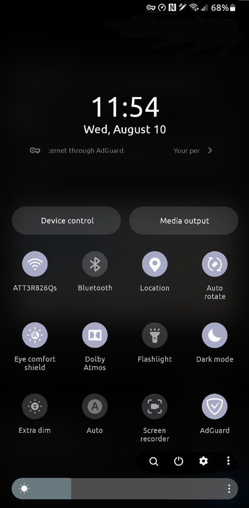
- « Previous
-
- 1
- 2
- Next »
- Mark as New
- Bookmark
- Subscribe
- Mute
- Subscribe to RSS Feed
- Permalink
08-11-2022 08:49 AM in
SuggestionsHello,
Thank you very much for your suggestion. Your suggestion has been communicated to the developer and the development project manager is reviewing the content. After reviewing your suggestions, we will apply them to the official version if your proposal matches our concept. We appreciate your contribution to the beta program.
Regards,
One UI Beta Team
- Mark as New
- Bookmark
- Subscribe
- Mute
- Subscribe to RSS Feed
- Permalink
- Report Inappropriate Content
08-11-2022 12:01 PM in
Suggestions- Mark as New
- Bookmark
- Subscribe
- Mute
- Subscribe to RSS Feed
- Permalink
- Report Inappropriate Content
08-11-2022 12:33 PM in
Suggestions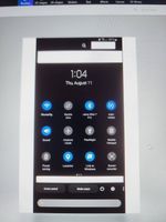
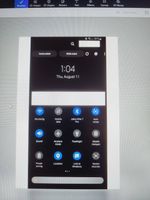
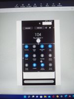
- Mark as New
- Bookmark
- Subscribe
- Mute
- Subscribe to RSS Feed
- Permalink
- Report Inappropriate Content
08-11-2022 12:35 PM (Last edited 08-11-2022 12:36 PM ) in
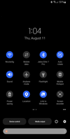
SuggestionsYou will notice, there is no more search button. We dont need there as you can see . Look nice and clean. Please Folks like my job , Samsung will introduce this in the next update, i dont need promotion. I just want to be heard.
Samsung thank you vor you hard work.
REGARDS!
- « Previous
-
- 1
- 2
- Next »
