- Mark as New
- Bookmark
- Subscribe
- Mute
- Subscribe to RSS Feed
- Permalink
- Report Inappropriate Content
10-11-2022 06:11 AM (Last edited 10-11-2022 10:33 AM ) in
Suggestions

- Mark as New
- Bookmark
- Subscribe
- Mute
- Subscribe to RSS Feed
- Permalink
- Report Inappropriate Content
10-11-2022 07:08 AM (Last edited 10-11-2022 07:08 AM ) in
Suggestions- Mark as New
- Bookmark
- Subscribe
- Mute
- Subscribe to RSS Feed
- Permalink
- Report Inappropriate Content
10-11-2022 07:32 AM in
Suggestions- Mark as New
- Bookmark
- Subscribe
- Mute
- Subscribe to RSS Feed
- Permalink
- Report Inappropriate Content
10-11-2022 09:48 AM (Last edited 10-11-2022 09:53 AM ) in
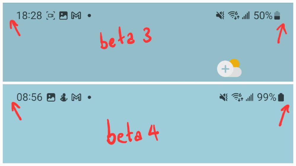
SuggestionsIf I had not taken a screenshot for that, I would not have had it on hand.
- Mark as New
- Bookmark
- Subscribe
- Mute
- Subscribe to RSS Feed
- Permalink
- Report Inappropriate Content
10-11-2022 08:05 AM in
Suggestions- Mark as New
- Bookmark
- Subscribe
- Mute
- Subscribe to RSS Feed
- Permalink
10-13-2022 05:41 AM in
SuggestionsHello,
Thank you for your Feedback. We appreciate your contribution to the Beta community.
Regards,
One UI Beta Team
