- Mark as New
- Bookmark
- Subscribe
- Mute
- Subscribe to RSS Feed
- Permalink
- Report Inappropriate Content
08-08-2022 08:48 AM in
Suggestions
- Mark as New
- Bookmark
- Subscribe
- Mute
- Subscribe to RSS Feed
- Permalink
- Report Inappropriate Content
08-08-2022 09:01 AM in
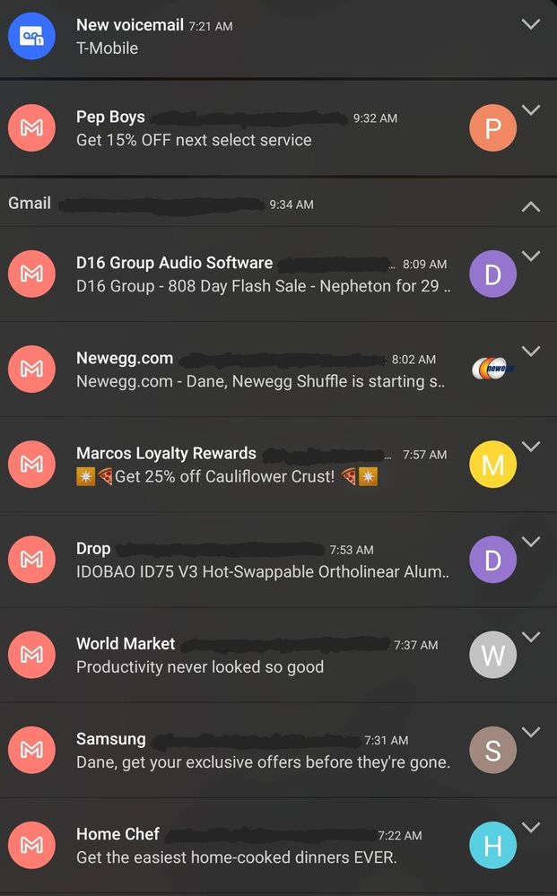
Suggestions- Slider to control the size of the icon
-option to toggle between Plate on all icons vs first notification
- Mark as New
- Bookmark
- Subscribe
- Mute
- Subscribe to RSS Feed
- Permalink
- Report Inappropriate Content
08-08-2022 01:10 PM in
Suggestions- Mark as New
- Bookmark
- Subscribe
- Mute
- Subscribe to RSS Feed
- Permalink
08-08-2022 03:19 PM in
SuggestionsHello,
Thank you very much for your suggestion. Your suggestion has been communicated to the developer and the development project manager is reviewing the content. After reviewing your suggestions, we will apply them to the official version if your proposal matches our concept. We appreciate your contribution to the beta program.
Regards
One UI Beta Team
- Mark as New
- Bookmark
- Subscribe
- Mute
- Subscribe to RSS Feed
- Permalink
- Report Inappropriate Content
08-08-2022 04:18 PM in
Suggestions- Mark as New
- Bookmark
- Subscribe
- Mute
- Subscribe to RSS Feed
- Permalink
- Report Inappropriate Content
08-10-2022 07:00 PM in
Suggestions