SuperOvni
Supernova
Options
- Mark as New
- Bookmark
- Subscribe
- Mute
- Subscribe to RSS Feed
- Permalink
- Report Inappropriate Content
11-15-2021 04:45 PM (Last edited 11-15-2021 04:49 PM ) in
Suggestions
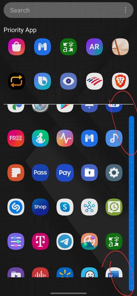
Picture no1
I'm sorry Samsung...but this don't looks good...


look at that bar, it's not lined up with anything and finally, in the empty space below where the apps do not reach the bar if it does...??????????
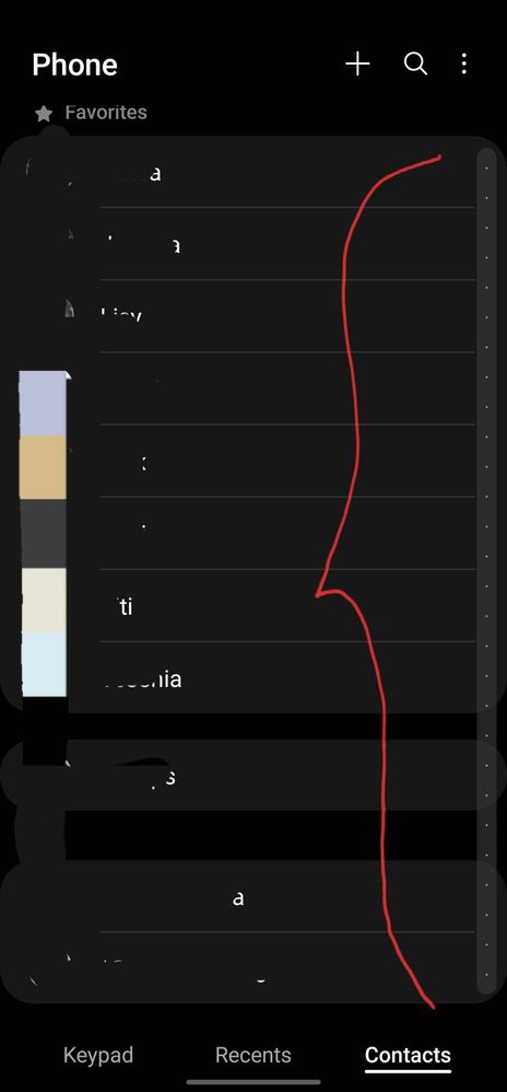
Picture no2
the bar has a harmony with the design in the contacts


2 Replies
Anthony232
Galaxy
Options
- Mark as New
- Bookmark
- Subscribe
- Mute
- Subscribe to RSS Feed
- Permalink
- Report Inappropriate Content
11-15-2021 06:14 PM in
Suggestions
It looks terrible I hate the hard bar at the bottom
USBetaModerator
Beta Moderator
Options
- Mark as New
- Bookmark
- Subscribe
- Mute
- Subscribe to RSS Feed
- Permalink
11-16-2021 07:11 AM in
SuggestionsHello @SuperOvni ,
Thank you for your feedback. We will pass on your feedback to our usability team for review.
Regards,
One UI Beta Team
