- Mark as New
- Bookmark
- Subscribe
- Mute
- Subscribe to RSS Feed
- Permalink
- Report Inappropriate Content
08-12-2022 01:37 AM in
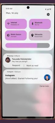
SuggestionsNotification Panel Redesign Needed
Samsung has been doing too much refinement. Refinement after a while gets boring.
There needs to be some redesigns, some fun. Something different. Other Android skins are improving year over year and trying things that work well, like OxygenOS 13. Samsung needs to do that.
Oxygen OS 13
Make Something that One UI suits
- Mark as New
- Bookmark
- Subscribe
- Mute
- Subscribe to RSS Feed
- Permalink
- Report Inappropriate Content
08-12-2022 02:27 AM in
SuggestionsSomething very cool!
It's been a while since we have same quick panel.
- Mark as New
- Bookmark
- Subscribe
- Mute
- Subscribe to RSS Feed
- Permalink
- Report Inappropriate Content
08-12-2022 03:14 AM in
Suggestions- Mark as New
- Bookmark
- Subscribe
- Mute
- Subscribe to RSS Feed
- Permalink
- Report Inappropriate Content
08-12-2022 04:26 AM in
Suggestions- Mark as New
- Bookmark
- Subscribe
- Mute
- Subscribe to RSS Feed
- Permalink
08-12-2022 05:43 AM in
SuggestionsHello,
Thank you very much for your suggestion. Your suggestion has been communicated to the developer and the development project manager is reviewing the content. After reviewing your suggestions, we will apply them to the official version if your proposal matches our concept. We appreciate your contribution to the beta program.
Regards,
One UI Beta Team
- Mark as New
- Bookmark
- Subscribe
- Mute
- Subscribe to RSS Feed
- Permalink
- Report Inappropriate Content
08-12-2022 11:01 AM in
SuggestionsThis is the same reply from you as I got in One ui beta 3 for s21..
Sammy ols listen to your consumers..
Or
Make it available through good lock
- Mark as New
- Bookmark
- Subscribe
- Mute
- Subscribe to RSS Feed
- Permalink
- Report Inappropriate Content
08-12-2022 06:55 AM in
Suggestions- Mark as New
- Bookmark
- Subscribe
- Mute
- Subscribe to RSS Feed
- Permalink
- Report Inappropriate Content
08-12-2022 07:10 AM in
Suggestions- Mark as New
- Bookmark
- Subscribe
- Mute
- Subscribe to RSS Feed
- Permalink
- Report Inappropriate Content
08-12-2022 08:44 AM (Last edited 08-12-2022 08:44 AM ) in
SuggestionsAlso, give us back the 6th quick access button.
- Mark as New
- Bookmark
- Subscribe
- Mute
- Subscribe to RSS Feed
- Permalink
- Report Inappropriate Content
08-12-2022 08:46 AM in
Suggestions

