missmotta
Comet
Options
- Mark as New
- Bookmark
- Subscribe
- Mute
- Subscribe to RSS Feed
- Permalink
- Report Inappropriate Content
10-09-2021 11:45 AM in
Suggestions
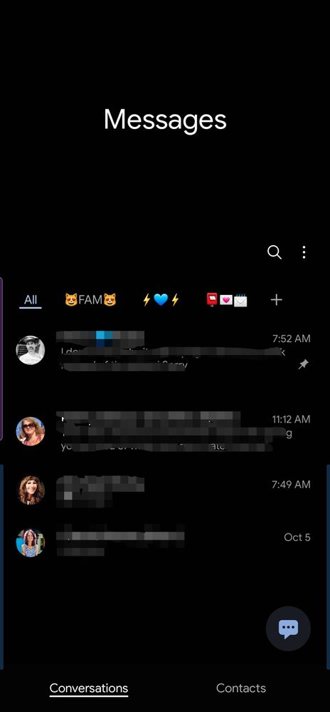
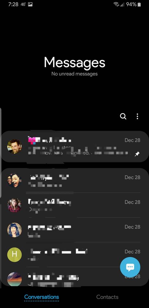
I don't love the new homescreen of the default Messages app.


The all-black background doesn't jibe well with all the other homescreens in Samsung native apps which all have a dark gray background in the menu pages.
The text is also waaay too tiny and doesn't match up with the other native apps.


Old vs new. Not a fan!!
4 Replies
jdunk312
Galaxy
Options
- Mark as New
- Bookmark
- Subscribe
- Mute
- Subscribe to RSS Feed
- Permalink
- Report Inappropriate Content
10-09-2021 11:52 AM in
Suggestions
I'm not of fan of either waste of alot of space at the top
missmotta
Comet
Options
- Mark as New
- Bookmark
- Subscribe
- Mute
- Subscribe to RSS Feed
- Permalink
- Report Inappropriate Content
10-09-2021 11:55 AM in
Suggestions
I believe they implemented this in the first iteration of One UI to make it easier to use one handed, at least thst was the idea.
SuperOvni
Supernova
Options
- Mark as New
- Bookmark
- Subscribe
- Mute
- Subscribe to RSS Feed
- Permalink
- Report Inappropriate Content
10-09-2021 12:25 PM in
Suggestions
I talked about that in a post, there is no uniformity and however in the contacts if there are separation lines and they use dark gray with dark mode...too many basics detail to improve.
USBetaModerator
Beta Moderator
Options
- Mark as New
- Bookmark
- Subscribe
- Mute
- Subscribe to RSS Feed
- Permalink
10-11-2021 09:33 AM in
SuggestionsHello @missmotta ,
Thank you for your feedback. We will pass on your feedback to our usability team for review.
Regards,
One UI Beta Team
