- Mark as New
- Bookmark
- Subscribe
- Mute
- Subscribe to RSS Feed
- Permalink
- Report Inappropriate Content
10-08-2021 07:13 PM in
Suggestions
- Mark as New
- Bookmark
- Subscribe
- Mute
- Subscribe to RSS Feed
- Permalink
- Report Inappropriate Content
10-08-2021 11:46 PM in
Suggestions- Mark as New
- Bookmark
- Subscribe
- Mute
- Subscribe to RSS Feed
- Permalink
- Report Inappropriate Content
10-09-2021 04:04 PM (Last edited 10-09-2021 04:05 PM ) in
Suggestions- Mark as New
- Bookmark
- Subscribe
- Mute
- Subscribe to RSS Feed
- Permalink
- Report Inappropriate Content
10-09-2021 01:05 PM in
Suggestions- Mark as New
- Bookmark
- Subscribe
- Mute
- Subscribe to RSS Feed
- Permalink
10-11-2021 08:57 AM in
SuggestionsHello @SuperOvni ,
Thank you for your feedback. We will pass on your feedback to our usability team for review.
Regards,
One UI Beta Team
- Mark as New
- Bookmark
- Subscribe
- Mute
- Subscribe to RSS Feed
- Permalink
- Report Inappropriate Content
10-23-2024 02:45 PM in
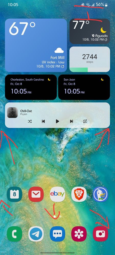
SuggestionsI just added the battery widget to the third home screen and made it as small as possible, but the icon takes up the left 1/4 and the 3/4 to the right is empty, and it doesn't fit on the home screen.
That is true for other widgets too, native widgets and 3rd party app widgets.
Please make widget borders not have empty gaps/space. Fit it to the icon.
- Mark as New
- Bookmark
- Subscribe
- Mute
- Subscribe to RSS Feed
- Permalink
- Report Inappropriate Content
10-23-2024 02:46 PM in
SuggestionsP.S. That's for Galaxy S22Ultra with Android 14 and OneUI 6.1.
