Saifu
Cosmic Ray
Options
- Mark as New
- Bookmark
- Subscribe
- Mute
- Subscribe to RSS Feed
- Permalink
- Report Inappropriate Content
09-14-2021 07:56 PM in
Suggestions
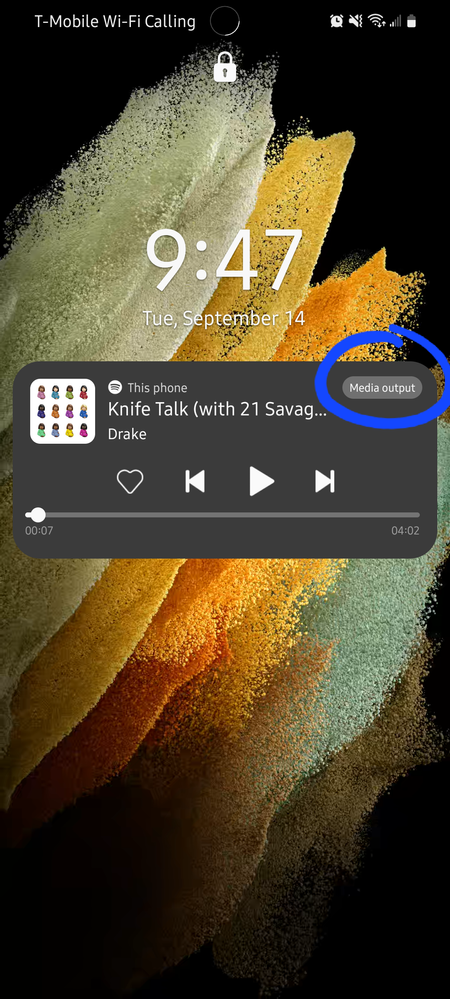
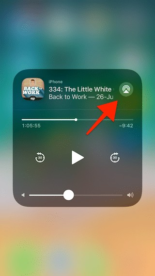
This is a suggestion that I believe will help make the music player look cleaner. I believe instead of having a button that says "Media output" you guys should implement a button with simple icon that could represent changing audio devices. A common example would be the way iOS has it. Examples could be a pair of headphones. Attached is the picture of how it is implemented in One UI 4 vs iOS. This change should also be implemented in the music player that is shown on the home screen as well, not just the lock screen.


2 Replies
USBetaModerator
Beta Moderator
Options
- Mark as New
- Bookmark
- Subscribe
- Mute
- Subscribe to RSS Feed
- Permalink
09-15-2021 01:14 PM in
SuggestionsHello ,
As issue involves a 3rd party app, fix needs to be performed from the application side. It would be best if you let app developers know of this issue through their support channels.
Regards,
One UI Beta Team
Saifu
Cosmic Ray
Options
- Mark as New
- Bookmark
- Subscribe
- Mute
- Subscribe to RSS Feed
- Permalink
- Report Inappropriate Content
09-16-2021 08:29 AM in
Suggestions
I think you are mistaken. I also have a Tab S7+ which I looked at the music player interface on and it does not have a "Media output" button. It instead has a simple button for changing audio devices like that small circle. The change went into effect when I installed One UI 4. 

