userZNnTdcqwZP
Supernova
Options
- Mark as New
- Bookmark
- Subscribe
- Mute
- Subscribe to RSS Feed
- Permalink
- Report Inappropriate Content
10-21-2022 06:08 PM (Last edited 10-23-2022 06:34 AM ) in
Suggestions
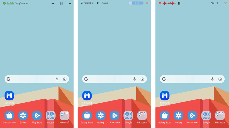
The idea is very similar to the stacked widgets, so we can swipe left/right on the status bar to see and interact with other things.


For example, we could add a music player on the status bar. It could show song's name on the left of the punch hole and control buttons (play/pause, skip, previous) on the right of the punch hole.
We could add a status bar about the battery of the connected devices like Galaxy buds and watch, so we just swipe and have a quick look.
We could add a bar about the weather so we could have a quick glance.
We could add timer and stopwatch on it.
And more...
I know that swiping down the notification panel could do some or all of that, but I think it would be nice to not block the whole screen every time with the notification panel. Plus, if we were reading or looking at something on the screen, we would not have to go to the home screen, look at the widgets, and then come back to whatever screen we were on. It's definitely too late for this One UI5, but I hope this would at least be considered for the future One UI.
Edit:
here is what it could look like. Even though it seems to be too little space at the top (about 5-6 mm height), it has enough space to put essential functionality (UI design is the key I guess).


Reply
1 Reply
USBetaModerator2
Beta Moderator
Options
- Mark as New
- Bookmark
- Subscribe
- Mute
- Subscribe to RSS Feed
- Permalink
10-23-2022 11:14 PM in
SuggestionsHello,
Thank you very much for your suggestion.
Your suggestion has been communicated to the developer and the development project manager is reviewing the content. After reviewing your suggestions, we will apply them to the official version if your proposal matches our concept.
We appreciate your contribution to the beta program.
Regards,
One UI Beta Team
Opens in new window
PDF Download
Word Download
Excel Download
PowerPoint Download
Document Download
