- Mark as New
- Bookmark
- Subscribe
- Mute
- Subscribe to RSS Feed
- Permalink
- Report Inappropriate Content
02-16-2023
05:40 PM
(Last edited
11-26-2023
06:51 PM
by
![]() SamsungChelsea
) in
SamsungChelsea
) in
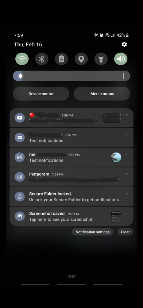
I'm coming off the S10+ and I love this new phone but I don't like the generic looking notification icons. Is this how it looks on the new UI? The S10+ has the actual icon of the app which was easy to spot. I've searched all the options and the only thing I can find is switching color palettes from this blue to other dull colors.

Solved! Go to Solution.
- Mark as New
- Bookmark
- Subscribe
- Mute
- Subscribe to RSS Feed
- Permalink
- Report Inappropriate Content
02-16-2023 05:51 PM in
Galaxy S23- Mark as New
- Bookmark
- Subscribe
- Mute
- Subscribe to RSS Feed
- Permalink
- Report Inappropriate Content
02-17-2023 06:50 AM in
Galaxy S23- Mark as New
- Bookmark
- Subscribe
- Mute
- Subscribe to RSS Feed
- Permalink
- Report Inappropriate Content
02-27-2023 09:50 PM (Last edited 02-27-2023 09:50 PM ) in
Galaxy S23- Mark as New
- Bookmark
- Subscribe
- Mute
- Subscribe to RSS Feed
- Permalink
- Report Inappropriate Content
02-17-2023 09:31 AM in
Galaxy S23- Mark as New
- Bookmark
- Subscribe
- Mute
- Subscribe to RSS Feed
- Permalink
- Report Inappropriate Content
02-17-2023 10:01 AM in
Galaxy S23Now leaving the color pallete off means I have to stick to the stock blue colors for the quick panel icons. Unless my phone is bugged.
The notification icons now have separate colors but I truly miss the app icons we had before the update. Kind of a bummer.


- Mark as New
- Bookmark
- Subscribe
- Mute
- Subscribe to RSS Feed
- Permalink
- Report Inappropriate Content
03-05-2023 09:22 AM in
Galaxy S23I have the same request: to be able to not color the app icons while theming the rest of the notification drawer's colors.
As it stands now, the colors of the icons appear muted (and a bit harder to read) after the theme has been applied.
